Starting with a research on optimizing the SaaS customers’ acquisition funnel, I decided to focus on analyzing the conversion from a visitor to a registered free trial user. I examined about 50 SaaS systems starting from the most known ones, such as Salesforce.
Checkout I Am OnDemand YouTube Channel and rate those 26 free trial jumps.
Software professionals such as product, development and operation managers tend not to give the free trial mechanism the right attention, as the free trial is just a “single simple form”. From their perspective it is part of the product’s marketing website and ins’t part of the whole service. This approach brings some of the SaaS vendors to spend almost all of their planning and development investments on the application. No doubt that this is a mistake, the free trial process has a very important role in the SaaS business life. The free trial mechanism should not be left behind, it is an integral part of the product and must be smart, measured precisely and improved continuously.
Trying to categorize the different “free trial mechanisms” was a bit tricky due to the plenty considerations that should be taken in mind: what is the target market? What model does the system support – B2C? B2B? Enterprise? How complicated are the business values that the SaaS offering present (Social software requires less setup info than financial software)? Etc.
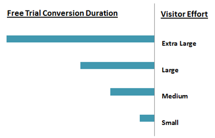
Finally I decided to categorize the products I tested, by the visitors’ effort needed to convert, hence the duration till the new visitor converts to a new user. Categorizing by this feature doesn’t means that faster is better, it is just faster. This segmentation might not fit to all the different SaaS offerings:
- Small – Registration straight from the www site homepage, with almost no setup actions.
- Medium – The free trial process requires switching through several pages in the “www site” (I use this term to talk about the marketing website of the product).
- Large – The free trial process includes jumping to the mail box in order to complete the registration stage and login to the application.
- Extra Large – The free trial process doesn’t end with login to the application and the visitor will need to wait for someone to return a call.

Most of the applications I tested fit into the 2nd and the 3rd categories. I am sure that some of those vendors can improve the process easiness by stepping up to the 1st category or at least move from the 3rd to the 2nd. There are several considerations in belonging to the 4th like the maturity of the product, some of the young vendors will want to have a personal touch with their visitors on the alpha phase to understand their potential market needs. Some vendors will not want to reveal the application on a free trial due to competition. I also heard some saying that for enterprise software solutions free trial is not part of the customer acquisition process, for my opinion this approach holds a lack of vision.
The free trial 3 steps model
Your visitors don’t want to spend time if the service’s value is not clear and they will not mind spending time if the value presented is clear to fit to their needs. Most of the free trials jumps I tested can be entered into “the free trial 3 steps model” including 3 pages, that the visitor goes through at the free trial sign-up procedure.

> > > > > 1. The WWW homepage

Make sure that the www homepage presents the application’s basic values in a glance and give an option to drill down to read more. Make sure to know your audience’s needs, not only the specifics you can help them with, and provide an appealing and relevant content. Use graphics creative design to catch your visitors’ eyes and social tools to strengthen the communication with them. There are no limits to the creativity that you can present here, think out of the “Salesforce free trial box” and don’t forget to measure your visitors’ habits.

There are some leading SaaS vendors that designed their free trial process to include the pricing page. The main button on the www site homepage is “Pricing and Plans” button, clicking it forwards the visitor to the pricing page that includes also an option for a free trial. When I am interested in buying something I first want to understand that it solves my needs and only then I will ask for its price. I believe that the free trial button is still essential and I suggest giving an access to the free trial and then the option to check the pricing plans.
Following my free trials research here are a few insights regarding the www homepage –
- Put links to your social tools and show blogs’ content.
- Use videos to present the application and to show you customers’ success stories.
- Content should be dynamic and change according to the visitors reactions.
- The free trial button must be unique and available on all website pages. Also make sure that it is visible when scrolling.
- Although it sounds obvious, please make sure there are no errors on the page, specifically when clicking on the free trial button.
> > > > > > 2. The Registration Form

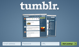
Once your customer decided to take the free trial, you should make it is perfectly easy and smooth (I would say fast as well) to start the application trial. When planning the registration form, I suggest to start from understanding that an email and a password is enough to be able to convert a visitor to a user. You should examine carefully all other fields that seem to be necessary to start the trial (URL, number of employees) or any other information you like to get from your visitors (Phone#, how did you hear about us?).
- From the visitor perspective the details submission is an instantaneous step before jumping into the application hence he will be fully focused on a quick submission of the form. I found some that show minimal content such as a quote of a happy customer, this is nice but why bother the eyes, the registration form will be enough.
- Once submitting the form the visitor should immediately be forwarded into the application. Even for security products a good option to solve identity issues will be by activating specific features inside the application by an email confirmation.
- Again don’t forget to measure. For new SaaS vendors I will strongly suggest to go with Multivariate Tests to optimize the registration form.
> > > > > > 3. The Application Landing Page

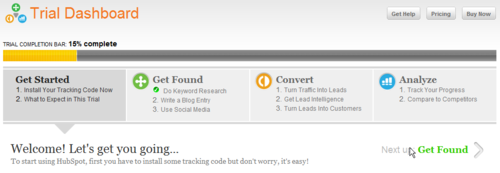
Once the free trial form was submitted and the visitor becomes a user, the user will be forwarded to the application’s landing page that has a very important role in the free trial jump. The first moves in the application must reveal the user to the benefits and present clearly how those align with the business needs. It is important to control the users’ actions and make sure that they demonstrate the system values, so don’t forget to measure! and improve continuously. Here are some points that you should consider when planning the application’s landing page:
- Emphasize basic actions to lead the customer to the main system work flows. For B2B systems an option to check a specific role view and workflows can be nice (check SugarCRM free trial as an example).
- Put links to training materials and knowledge. Some systems implant support videos in the landing page to help the visitor get started.
- Depending on your customers’ support capabilities, you can put an option to contact a person for an immediate live support.
- Make sure that the trial account includes default values so the user will see the application at work.
- Suggest and do not force Setup of the account.
- Link to pricing and show how much time is left for the free trial.
I found the following presentation and would like to share it with you as it is a great resource for understanding how to design your sign-up process.
Designing For Sign Up
There is a lot more to consider when planning the customers’ acquisition funnel of a SaaS system: How to increase the awareness of the www site? How does the email to the new user look like? How to present the pricing plans? How to measure? How long should the free trial be, 15 or 30 days? Although I thought that this subject is mature enough, I found that it is not. The free trial jump is still evolving and I feel that there is plenty of room for new creative ideas, just don’t forget to measure !
To continue the free trial discussion you are welcome to join the my LinkedIn discussion.
